The complete toolbox for Enterprise Production Reporting
Availability
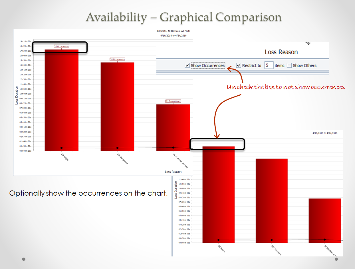
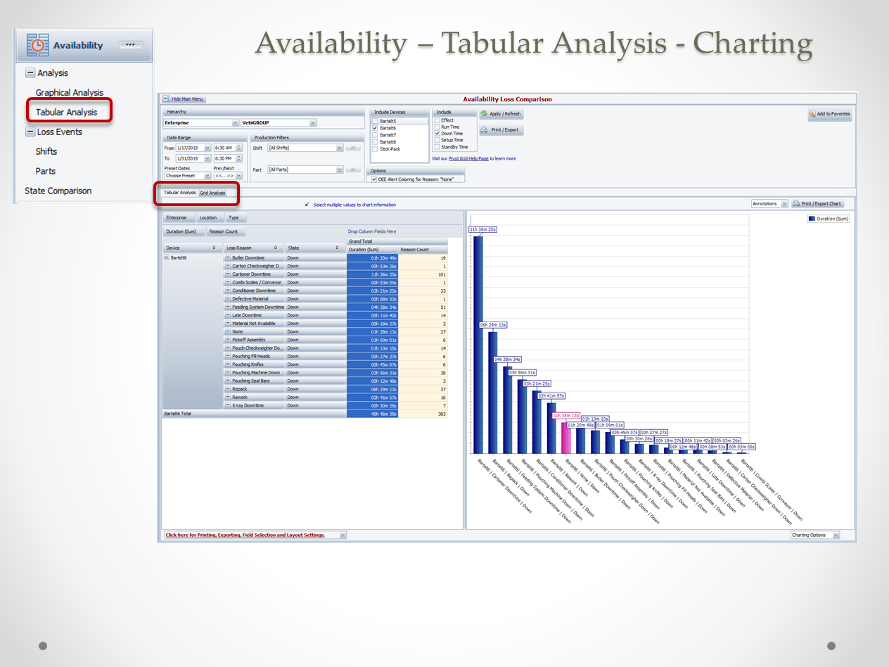
Graphically view top losses and runtime by any hierarchy - Plant, Line, Shift or Part - by all or specific reason codes.
Views include Pareto Charts, Pivot Grids and State Comparison Charts.

The cost of NONE! Learn how to define a custom field and calculate the cost of your downtime.

A Paynter Chart is a combination Run Chart with Pareto chart. Use this to see if your improvement projects are sustaining.
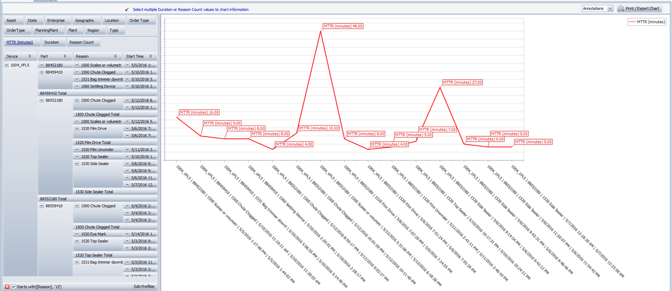
This Tool Tip will guide you through the process of creating the MTTR report in OEE Studio.
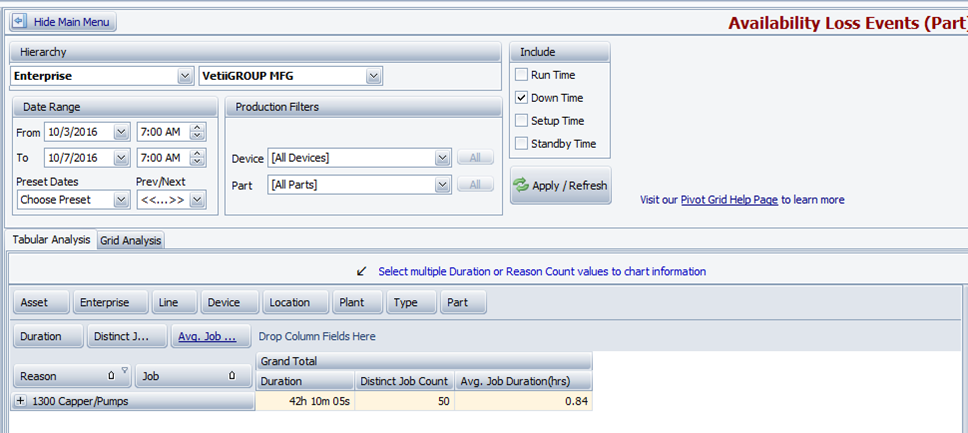
Finding Average Duration of specific events! Do you want to find the average duration of a specific loss event by the number of Jobs or Parts that you ran?
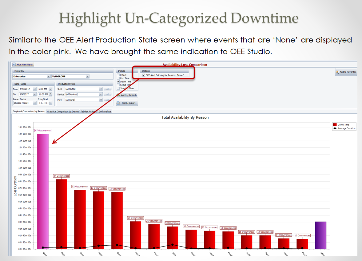
Highlight 'NONE' Downtime Similar to OEE Alert Production State screen you can now highlight reason code None downtime.

Analyze Loss Percentage to Total Production Time Create a report that shows the percent of losses to the total line production time.

Top Value Filtering Find the Top 3 downtime reasons for a specific category of downtime, by line.

New-5.0 Create custom duration fields, with HH:MM:SS format for MIN, MAX and Average time.
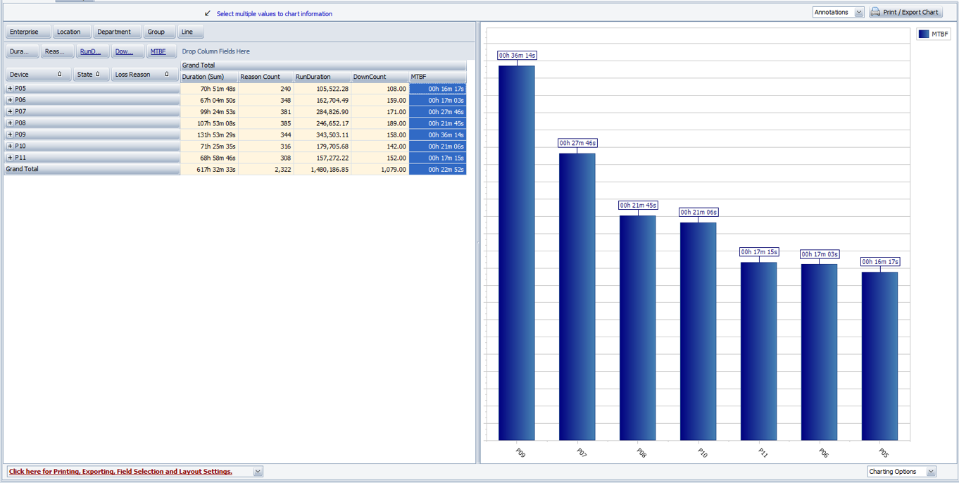
New Create custom fields to calculate MTBF. "Mean Time Between Failures" is literally the average time elapsed from one failure to the next. Usually people think of it as the average time that something works until it fails and needs to be repaired (again). MTBF is the average amount of time a machine or system is up and running between failures.
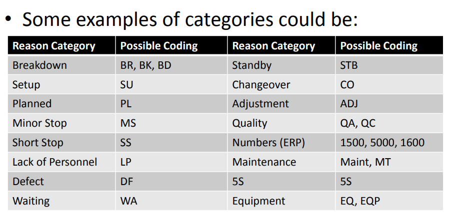
Reason Code Hierarchy If you have your Vorne XLv1 reason codes setup with hierarchical categories, you can learn how to split them into new fields.

